Client
Aurora Health Spa
Project Type
Timeline
2 Months
Tech Stack
As part of my foundation degree in Interactive Media Design, I was given a brief for a client, Aurora Health Spa, and was asked to design and develop a suitable website based on the provided specs and also produce a written report on the process.
Aurora Health Spa, located on the Eastern coast of Northern Ireland, provides a new spiritual retreat for people looking to relax.
The website will be aimed towards women aged twenty-five to sixty-five, however the spa also offers services for men too. Currently catering for small groups of people, the spa wishes to invite individuals to relax as well.
Opening soon, they are looking for a website to promote their services, offering a clean and contemporary look to represent their brand.
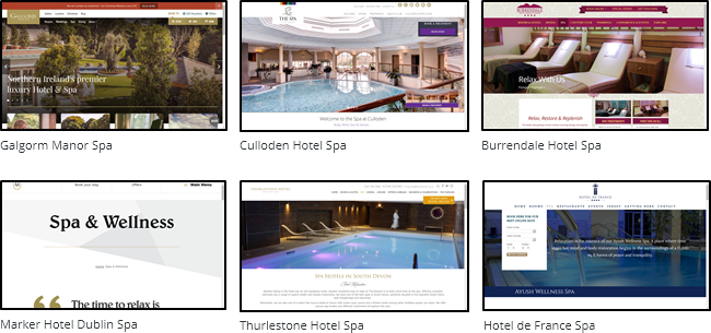
I analysed competitors’ websites and websites that the client showed preference for:
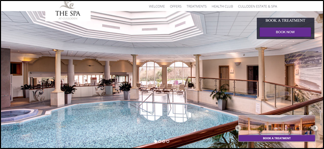
Aurora Health Spa is not the only one of its kind here in Northern Ireland. In fact, Galgorm Manor Spa, Culloden Hotel Spa and Burrendale Hotel Spa seem to be their current competitors. Knowing this, I felt it would be useful to evaluate their websites.
For all six websites, I focused on analysing the colour scheme, typography and overall layout.
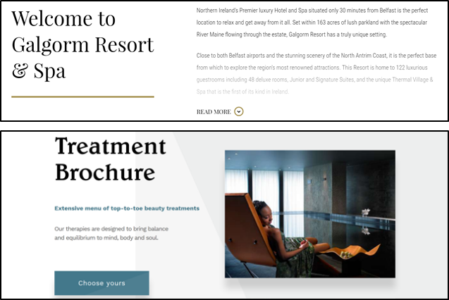
It was interesting to note that, in the websites that the client showed preference for, they all made use of whitespace and a more 'clean' look. It became obvious why their preference in the design of these websites consisted of a very ‘less is more’ aesthetic. With the use of white, other colours in the palette were given the opportunity to stand out.
The colour schemes for each of the six websites stayed consistent with their corporate identity. Keeping colours consistent with brand colours can help form memorability for the business so that customers are more likely to recognise it[1]. This is especially important for new businesses that are building up their credibility, as was the case for my client.
Looking at the six websites, they all used a mixture of serif and sans-serif fonts. In particular, the majority seemed to utilise serif typefaces for headings and sans-serif for general body text.
The use of sans-serif fonts for general text may be purely for aesthetic reasons as research has suggested that sans-serif fonts tend to look more sophisticated, futuristic, and modern[2]. It could also be speculated that sans-serif fonts are easier to read on screen, as suggested by research, due to the lack of serifs[3]. This improves readability for the users, making the use of sans-serif fonts for normal body text perfectly suitable.
The headings also tended to use typefaces with more personality, while body text consisted of a more neutral typeface. Combining fonts in a way that visually separates different textual elements like headings, sub-headings, body and captions, with the added help of size and weight, can create a visual hierarchy[4]. This means that users can easily separate headings from sub-headings from body and so on. This, once again, aids in the readability of content on the website.
The layout of a website greatly influences a user’s experience of it, helping to determine what the website should look like, how easy the content is to read and the kind of experience that users will have when they visit the site[5].
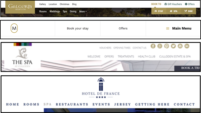
All six of the websites had their navigation placed at the top, making it quick and easy to access for users. It is important to think about what users want to do and help them complete those tasks in the easiest and most intuitive way possible[6]. Placing navigation at the top is a purposeful design, allowing users to find the information they need quickly and with minimal effort.
Aside from navigation, the business logos were also placed at the top of the page. This is important as logos are the single biggest representation of a brand and are used to promote the brand[7]. By having logos at the top of the page, users are very likely to notice it and remember the brand.
It should also be noted that all the websites greeted users with a large image on the homepage, taking up the full viewport height and width of the screen. The reasoning behind its use could be speculated to be that users tend to prefer images over text, perhaps because we naturally favour any information that can be grasped in seconds, if not instantaneously[8].
Knowing how important colour is to the aesthetic and appeal of a website, it was important to first establish the colour scheme for the website.
From previous research, it was clear that keeping the colour palette of the website consistent with the branding of the business would form a much more cohesive design. Fortunately, Aurora already had a logo from which I was able to draw out the following colours.
To comply with current standards in colour with regards to accessibility and ensure that users with various visual impairments would not be disadvantaged by visiting the website, I followed the Web Content Accessibility Guidelines 2.1 to, at the very least, ensure that text on the website would be readable. I did this by ensuring that there was high contrast between the colours used for the background and foreground text.
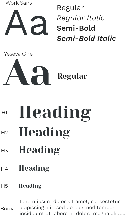
The aim was to settle on typefaces that were legible and provided the ability to change font weight to create a visual hierarchy. Furthermore, for this project, it was best to have open source typefaces to remove the need for licensing for commercial uses, so I gathered typefaces from the Google Fonts library.
From previous research, other spa websites seemed to use a combination of serif and sans-serif fonts and make use of font weight. Similarly, I used Yeseva One for headings and used Work Sans for normal body text to allow for contrast between different textual elements, creating a visual hierarchy and aiding in the readability of the website content.
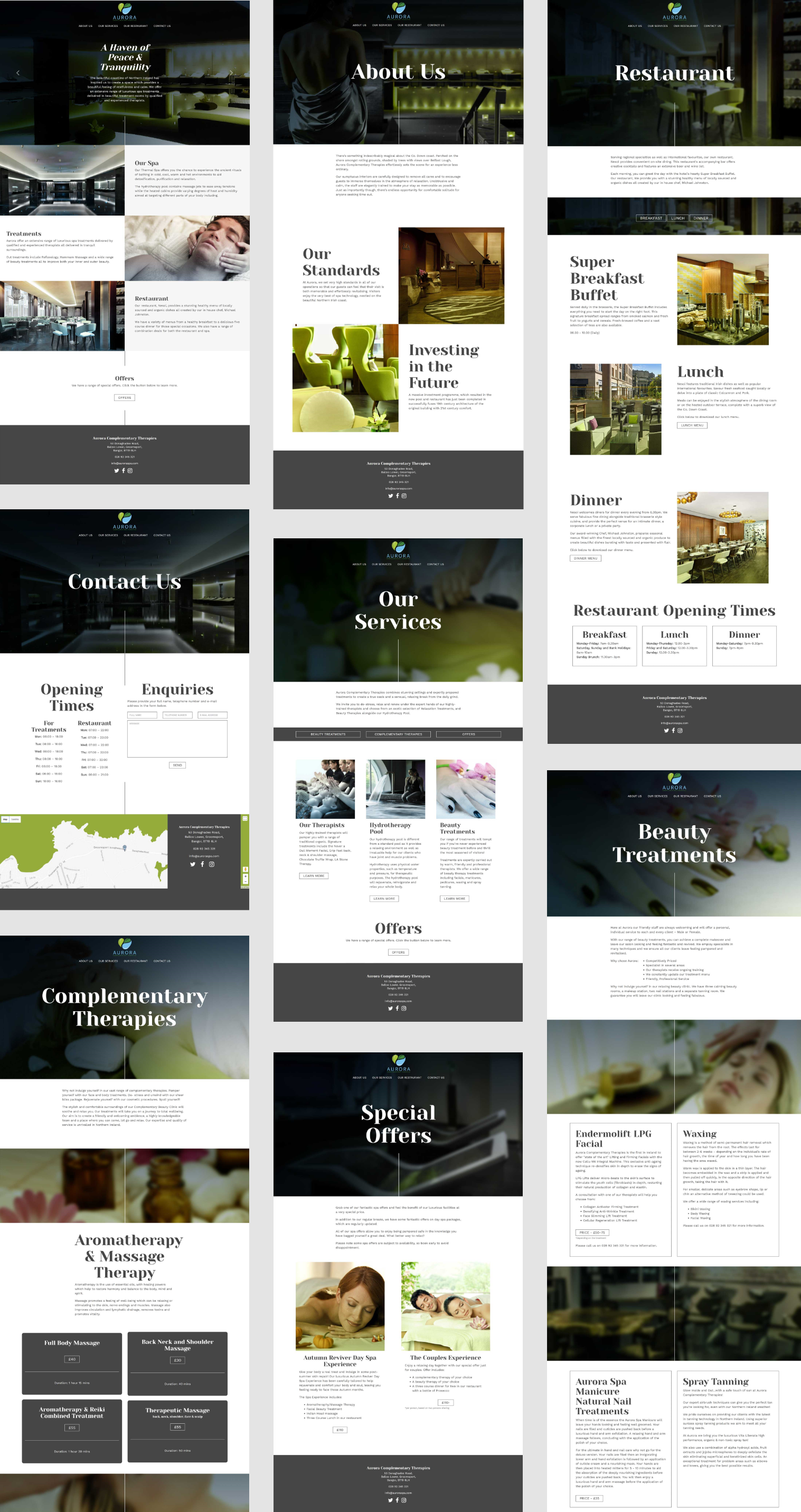
The client wanted the website to be clean and modern with regards to aesthetic.
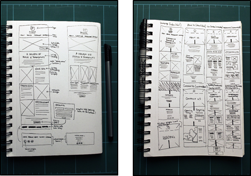
After conducting research, I first sketched out a few draft designs for the pages on the website.
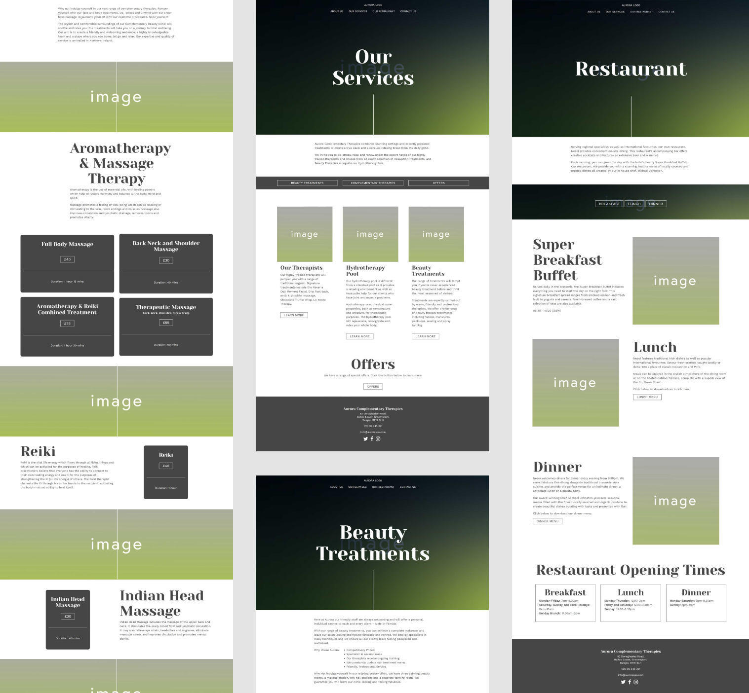
After this, I then created HTML wireframes using the drafts I had sketched out as guidance. This helped me to better understand where elements would be placed, what colours would be used and a glimpse into how the final website would look.
Also, because these wireframes were done through HTML, I could easily develop into an actual website after. This also helped to outline the user flow so I could see how users would interact with the website.
[1]Stec, C., 2013. How to Make a Strong Impression Through Brand Consistency. [Online]
Available at: https://www.impactbnd.com/blog/importance-brand-consistency
[Accessed 22 October 2017].
[2]Koepke, C., 2011. Serif or Sans-Serif?. [Online]
Available at: https://churchm.ag/serif-or-sans-serif/
[Accessed 12 October 2017].
[3]Kole, S., 2013. Serif Vs. Sans: the Final Battle. [Online]
Available at: http://www.webdesignerdepot.com/2013/03/serif-vs-sans-the-final-battle
[Accessed 22 October 2017].
[4]Kliever, J., 2015. 10 Golden Rules You Should Live By When Combining Fonts: Tips From a Designer. [Online]
Available at: https://designschool.canva.com/blog/combining-fonts-10-must-know-tips-from-a-designer/
[Accessed 22 October 2017].
[5]Evans, C., 2012. The Importance of Web Design Layout. [Online]
Available at: http://www.ampheon.co.uk/blog/the-importance-of-web-design-layout
[Accessed 23 October 2017].
[6]Pereyra, I., 2017. 10 Steps to an Engaging User Experience. [Online]
Available at: http://www.creativebloq.com/ux/10-steps-engaging-user-experience-3156607
[Accessed 23 October 2017].
[7]Kenny, T., 2009. The Use of Logos in Web Design. [Online]
Available at: http://tomkenny.design/articles/the-use-of-logos-in-web-design/
[Accessed 23 October 2017].
[8]Stark, H., 2014. Which is More Important in Design: Images or Text?. [Online]
Available at: https://www.sitepoint.com/images-text-important/
[Accessed 23 October 2017].